
FM27 Interface
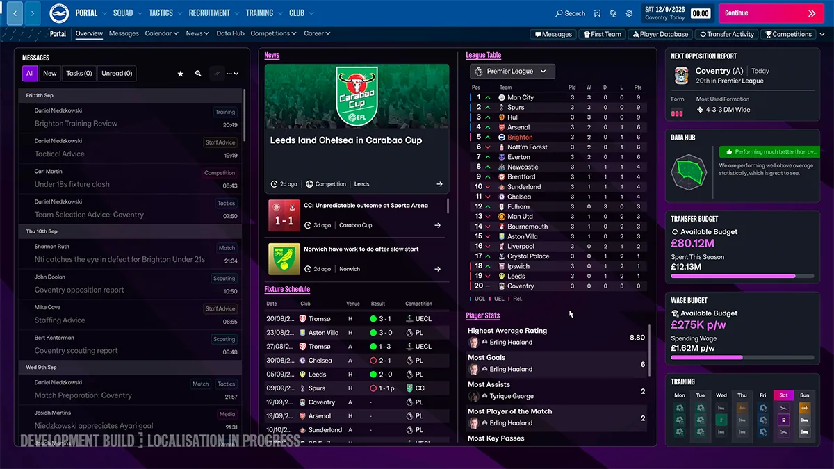
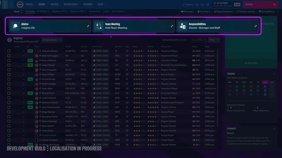
Football Manager 26's interface was the complaint that followed the game around. Football Manager 27's answer is an official deep dive called clearer interface, smoother navigation. The stills show a top bar — Portal, Squad, Tactics, Recruitment, Training, Club — and a second row for Overview, Messages, Calendar, News, Data Hub, Competitions and Career.
The portal still is a three-column desk: messages, news and fixtures, a league table, and a right rail for the next opponent, data hub, budgets and training. That is the picture on the official page, marked as a development build. I am not claiming the shipping layout is pixel-identical.
Eurogamer’s accessible preview interview discusses the return of familiar interface elements with cautious optimism. That is one author’s impression. This site has not independently verified the other media verdicts, Reddit claims or a current Metacritic aggregate; those are not presented as established evidence of the interface’s quality.
Density settings are part of the official description: default, detailed and condensed. Colour is also supposed to follow the club or the competition instead of one purple everywhere. Those are claims from the feature page, not measurements.
Is the FM26 UI fixed?
Sports Interactive says navigation is clearer. Eurogamer’s accessible preview is cautiously optimistic; this site has not independently verified a current aggregate score.
Where is the navigation?
Across the top, not down the left. The official stills show six main sections.
Can I make the screen denser?
The feature page describes default, detailed and condensed densities.